SwiftUI Color Themes
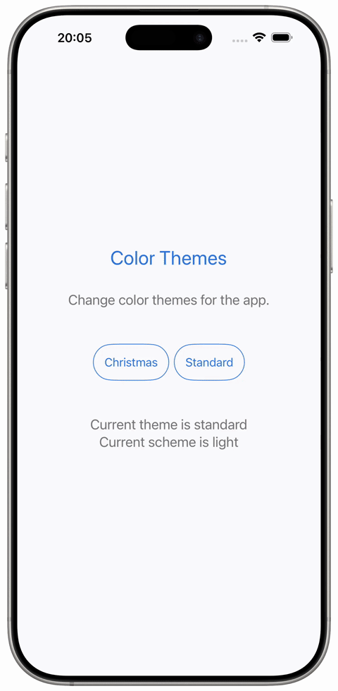
An amazing addition to an app are color themes. Users can select a theme, which they prefer or themes could change depending on the current season.
The sample code builds a ThemeManager, which organizes Themes. A Theme collects the color sets for the UI parts like background, primary and secondary foreground colors. A ThemeColorSet holds variants for light and dark mode.
For instance a foreground style is applied using this line `.foregroundStyle(currentTheme.primary.resolved(for: colorScheme))`. When changing the `currentTheme` property of the ThemeManager, the app's appearance will update and it will match the dark or light color scheme.
 import SwiftUI
@main
struct ColorThemesApp: App {
@StateObject var themeManager = ThemeManager()
var body: some Scene {
WindowGroup {
ContentView()
.environmentObject(themeManager)
}
}
}
class ThemeManager: ObservableObject {
@Published var currentTheme: AppTheme = .standard
init() { }
}
struct ThemeColorSet {
let light: Color
let dark: Color
}
extension ThemeColorSet {
func resolved(for colorScheme: ColorScheme) -> Color {
switch colorScheme {
case .light:
return light
case .dark:
return dark
@unknown default:
return light
}
}
}
struct Theme {
let primary: ThemeColorSet
let secondary: ThemeColorSet
let background: ThemeColorSet
}
enum AppTheme: String {
case standard
case christmas
}
extension AppTheme {
var theme: Theme {
switch self {
case .standard:
return Theme(
primary: ThemeColorSet(
light: Color(red: 0.18, green: 0.45, blue: 0.86),
dark: Color(red: 0.39, green: 0.72, blue: 1.00)
),
secondary: ThemeColorSet(
light: Color(red: 0.45, green: 0.45, blue: 0.48),
dark: Color(red: 0.78, green: 0.78, blue: 0.82)
),
background: ThemeColorSet(
light: Color(red: 0.98, green: 0.98, blue: 1.00),
dark: Color(red: 0.10, green: 0.10, blue: 0.12)
)
)
case .christmas:
return Theme(
primary: ThemeColorSet(
light: Color(red: 0.85, green: 0.15, blue: 0.20),
dark: Color(red: 0.70, green: 0.10, blue: 0.15)
),
secondary: ThemeColorSet(
light: Color(red: 0.05, green: 0.55, blue: 0.25),
dark: Color(red: 0.10, green: 0.65, blue: 0.30)
),
background: ThemeColorSet(
light: Color(red: 1.00, green: 0.98, blue: 0.95),
dark: Color(red: 0.25, green: 0.05, blue: 0.05)
)
)
}
}
}
struct ContentView: View {
@EnvironmentObject var themeManager: ThemeManager
@Environment(\.colorScheme) var colorScheme
var currentTheme: Theme {
themeManager.currentTheme.theme
}
var colorSchemeName: String {
switch colorScheme {
case .light:
return "light"
case .dark:
return "dark"
@unknown default:
return "unknown"
}
}
var body: some View {
ZStack {
currentTheme.background
.resolved(for: colorScheme)
.ignoresSafeArea()
VStack(spacing: 32) {
Text("Color Themes")
.font(.title)
.foregroundStyle(currentTheme.primary.resolved(for: colorScheme))
Text("Change color themes for the app.")
.font(.title3)
.foregroundStyle(currentTheme.secondary.resolved(for: colorScheme))
.padding(.bottom, 20)
HStack {
Button {
themeManager.currentTheme = .christmas
} label: {
Text("Christmas")
.foregroundStyle(currentTheme.primary.resolved(for: colorScheme))
.padding()
.overlay {
Capsule()
.stroke(currentTheme.primary.resolved(for: colorScheme), lineWidth: 1)
}
}
Button {
themeManager.currentTheme = .standard
} label: {
Text("Standard")
.foregroundStyle(currentTheme.primary.resolved(for: colorScheme))
.padding()
.overlay {
Capsule()
.stroke(currentTheme.primary.resolved(for: colorScheme), lineWidth: 1)
}
}
}
VStack {
Text("Current theme is \(themeManager.currentTheme.rawValue)")
.font(.title3)
.foregroundStyle(currentTheme.secondary.resolved(for: colorScheme))
.padding(.top, 20)
Text("Current scheme is \(colorSchemeName)")
.font(.title3)
.foregroundStyle(currentTheme.secondary.resolved(for: colorScheme))
.padding(.bottom, 20)
}
}
.padding()
}
}
}
#Preview {
ContentView()
.environmentObject(ThemeManager())
}
import SwiftUI

@main
struct ColorThemesApp: App {
    @StateObject var themeManager = ThemeManager()
    var body: some Scene {
        WindowGroup {
            ContentView()
                .environmentObject(themeManager)
        }
    }
}

class ThemeManager: ObservableObject {
    @Published var currentTheme: AppTheme = .standard

    init() { }
}

struct ThemeColorSet {
    let light: Color
    let dark: Color
}

extension ThemeColorSet {
    func resolved(for colorScheme: ColorScheme) -> Color {
        switch colorScheme {
        case .light:
            return light
        case .dark:
            return dark
        @unknown default:
            return light
        }
    }
}

struct Theme {
    let primary: ThemeColorSet
    let secondary: ThemeColorSet
    let background: ThemeColorSet
}

enum AppTheme: String {
    case standard
    case christmas
}

extension AppTheme {
    var theme: Theme {
        switch self {

        case .standard:
            return Theme(
                primary: ThemeColorSet(
                    light: Color(red: 0.18, green: 0.45, blue: 0.86),
                    dark:  Color(red: 0.39, green: 0.72, blue: 1.00)
                ),
                secondary: ThemeColorSet(
                    light: Color(red: 0.45, green: 0.45, blue: 0.48),
                    dark:  Color(red: 0.78, green: 0.78, blue: 0.82)
                ),
                background: ThemeColorSet(
                    light: Color(red: 0.98, green: 0.98, blue: 1.00),
                    dark:  Color(red: 0.10, green: 0.10, blue: 0.12)
                )
            )

        case .christmas:
            return Theme(
                primary: ThemeColorSet(
                    light: Color(red: 0.85, green: 0.15, blue: 0.20),
                    dark:  Color(red: 0.70, green: 0.10, blue: 0.15)
                ),
                secondary: ThemeColorSet(
                    light: Color(red: 0.05, green: 0.55, blue: 0.25),
                    dark:  Color(red: 0.10, green: 0.65, blue: 0.30)
                ),
                background: ThemeColorSet(
                    light: Color(red: 1.00, green: 0.98, blue: 0.95),
                    dark:  Color(red: 0.25, green: 0.05, blue: 0.05)
                )
            )
        }
    }
}

struct ContentView: View {
    @EnvironmentObject var themeManager: ThemeManager
    @Environment(\.colorScheme) var colorScheme

    var currentTheme: Theme {
        themeManager.currentTheme.theme
    }
    var colorSchemeName: String {
        switch colorScheme {
        case .light:
            return "light"
        case .dark:
            return "dark"
        @unknown default:
            return "unknown"
        }
    }

    var body: some View {
        ZStack {
            currentTheme.background
                .resolved(for: colorScheme)
                .ignoresSafeArea()

            VStack(spacing: 32) {
                Text("Color Themes")
                    .font(.title)
                    .foregroundStyle(currentTheme.primary.resolved(for: colorScheme))

                Text("Change color themes for the app.")
                    .font(.title3)
                    .foregroundStyle(currentTheme.secondary.resolved(for: colorScheme))
                    .padding(.bottom, 20)

                HStack {
                    Button {
                        themeManager.currentTheme = .christmas
                    } label: {
                        Text("Christmas")
                            .foregroundStyle(currentTheme.primary.resolved(for: colorScheme))
                            .padding()
                            .overlay {
                                Capsule()
                                    .stroke(currentTheme.primary.resolved(for: colorScheme), lineWidth: 1)
                            }
                    }

                    Button {
                        themeManager.currentTheme = .standard
                    } label: {
                        Text("Standard")
                            .foregroundStyle(currentTheme.primary.resolved(for: colorScheme))
                            .padding()
                            .overlay {
                                Capsule()
                                    .stroke(currentTheme.primary.resolved(for: colorScheme), lineWidth: 1)
                            }
                    }
                }
                VStack {
                    Text("Current theme is \(themeManager.currentTheme.rawValue)")
                        .font(.title3)
                        .foregroundStyle(currentTheme.secondary.resolved(for: colorScheme))
                        .padding(.top, 20)
                    Text("Current scheme is \(colorSchemeName)")
                        .font(.title3)
                        .foregroundStyle(currentTheme.secondary.resolved(for: colorScheme))
                        .padding(.bottom, 20)
                }
            }
            .padding()
        }
    }
}

#Preview {
    ContentView()
        .environmentObject(ThemeManager())
}