SwiftUI Card Flip
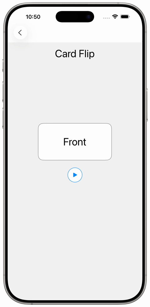
A simple card flip animation can be implemented in SwiftUI quite easily. For the flip transformation the modifier `rotation3DEffect()` works nicely.
To give flip animation some bouncy behaviour, the modifier `.animation()` with the `.spring()` method provides a nice visual appearance.
 import SwiftUI
struct SampleCardFlipView: View {
@State var isFlipped: Bool = false
var body: some View {
VStack(alignment: .center, spacing: 16) {
Text("Card Flip")
.font(.largeTitle)
.padding()
VStack(alignment: .center, spacing: 24) {
Spacer()
ZStack {
RoundedRectangle(cornerRadius: 16, style: .continuous)
.fill(.white)
.overlay(
RoundedRectangle(cornerRadius: 16, style: .continuous)
.stroke(Color.black.opacity(0.5), lineWidth: 1)
)
ZStack {
Group {
Text("Front")
}
.opacity(isFlipped ? 0 : 1)
Group {
if isFlipped {
Text("Back")
}
}
.opacity(isFlipped ? 1 : 0)
.rotation3DEffect(.degrees(isFlipped ? -180 : 0), axis: (x: 0, y: 1, z: 0))
}
}
.frame(maxWidth: 240, minHeight: 64)
.frame(maxHeight: 120)
.font(.largeTitle)
.rotation3DEffect(.degrees(isFlipped ? 180 : 0), axis: (x: 0, y: 1, z: 0))
.animation(.spring(response: 0.45, dampingFraction: 0.6), value: isFlipped)
Button(action: {
isFlipped.toggle()
}, label: {
Image(systemName: "play.fill")
.padding()
.background(Color.white, in: Circle())
.overlay {
Circle()
.stroke(Color.blue, lineWidth: 1)
}
})
Spacer()
Spacer()
}
.frame(maxWidth: .infinity)
}
.background {
Color(white: 0.95)
.ignoresSafeArea(edges: [.leading, .trailing, .bottom])
}
}
}
#Preview {
SampleCardFlipView()
}
import SwiftUI

struct SampleCardFlipView: View {
    @State var isFlipped: Bool = false

    var body: some View {
        VStack(alignment: .center, spacing: 16) {
            Text("Card Flip")
                .font(.largeTitle)
                .padding()

            VStack(alignment: .center, spacing: 24) {
                Spacer()

                ZStack {
                    RoundedRectangle(cornerRadius: 16, style: .continuous)
                        .fill(.white)
                        .overlay(
                            RoundedRectangle(cornerRadius: 16, style: .continuous)
                                .stroke(Color.black.opacity(0.5), lineWidth: 1)
                        )
                    ZStack {
                        Group {
                            Text("Front")
                        }
                        .opacity(isFlipped ? 0 : 1)

                        Group {
                            if isFlipped {
                                Text("Back")
                            }
                        }
                        .opacity(isFlipped ? 1 : 0)
                        .rotation3DEffect(.degrees(isFlipped ? -180 : 0), axis: (x: 0, y: 1, z: 0))
                    }

                }
                .frame(maxWidth: 240, minHeight: 64)
                .frame(maxHeight: 120)
                .font(.largeTitle)
                .rotation3DEffect(.degrees(isFlipped ? 180 : 0), axis: (x: 0, y: 1, z: 0))
                .animation(.spring(response: 0.45, dampingFraction: 0.6), value: isFlipped)


                Button(action: {
                    isFlipped.toggle()
                }, label: {
                    Image(systemName: "play.fill")
                        .padding()
                        .background(Color.white, in: Circle())
                        .overlay {
                            Circle()
                                .stroke(Color.blue, lineWidth: 1)
                        }
                })

                Spacer()
                Spacer()
            }
            .frame(maxWidth: .infinity)
        }
        .background {
            Color(white: 0.95)
                .ignoresSafeArea(edges: [.leading, .trailing, .bottom])
        }

    }
}

#Preview {
    SampleCardFlipView()
}