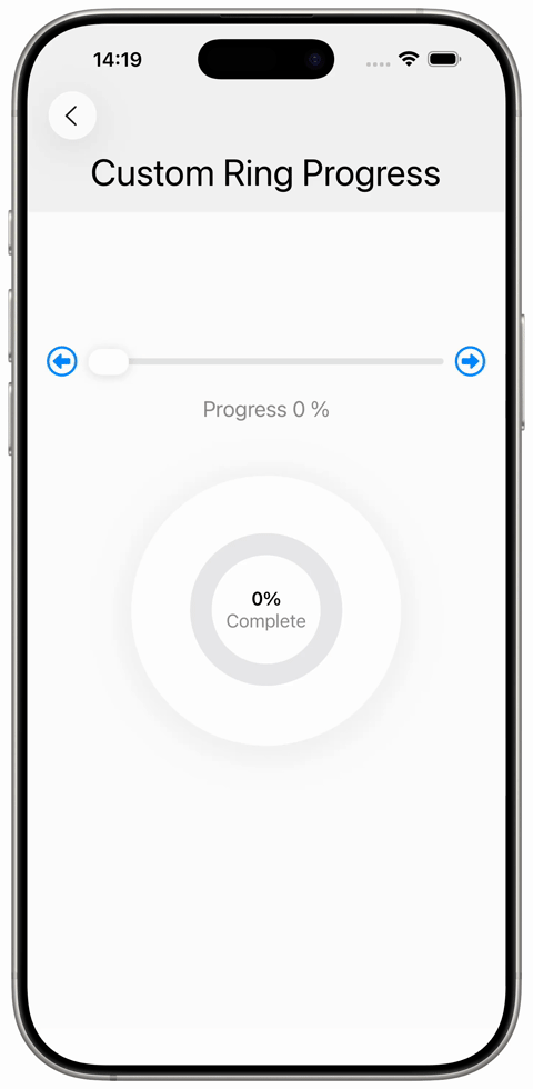
SwiftUI Custom Ring Progress View
A custom ring progress view with color gradient is implemented using `Circle()`, `.stroke` and `.trim`. Two circle paths are layered on top of each other to render the progress track and the actual progress ring.
The `.trim` modifier is used to specify which part of the Circle's stroke is actually drawn. An angular gradient is used to give the progress ring a more sophisticated appearance.
 import SwiftUI
struct SampleCustomProgessView: View {
@State private var progress: Double = 0
var body: some View {
VStack(spacing: 16) {
Text("Custom Ring Progress")
.font(.largeTitle)
VStack(spacing: 16) {
Spacer()
HStack {
Button(action: {
withAnimation { progress = 0 }
}, label: { Image(systemName: "arrowshape.left.circle").font(.title) })
Slider(value: $progress)
Button(action: {
withAnimation { progress = 1 }
}, label: { Image(systemName: "arrowshape.right.circle").font(.title) })
}
Text("Progress \(Int(round(progress * 100))) %")
.font(.title3)
.foregroundStyle(.secondary)
RingProgressView(percentCorrect: $progress)
.padding(64)
.background {
Color.white
}
.clipShape(Circle())
.shadow(color: Color(white: 0.2).opacity(0.1), radius: 20, x: 0, y: 4)
.padding(.vertical, 32)
Spacer()
Spacer()
}
.padding()
.frame(maxWidth: .infinity)
.background {
Color(white: 0.99)
.ignoresSafeArea(edges: .top)
}
}
.frame(maxWidth: .infinity)
.background {
Color(white: 0.95)
.ignoresSafeArea(edges: .top)
}
}
struct RingProgressView: View {
let ringWidth: CGFloat = 20
@Binding var percentCorrect: Double
var ringColor: Color {
let p = percentCorrect * 100
if p >= 90 { return .green }
if p >= 70 { return .yellow }
if p >= 50 { return .orange }
return .red
}
var body: some View {
ZStack {
Circle()
.stroke(Color.gray.opacity(0.2), lineWidth: ringWidth)
Circle()
.trim(from: 0, to: percentCorrect)
.stroke(
AngularGradient(
gradient: Gradient(stops: [
.init(color: .red, location: 0.0),
.init(color: .orange, location: 0.1),
.init(color: .yellow, location: 0.2),
.init(color: .green, location: 1.0),
]),
center: .center
),
style: StrokeStyle(lineWidth: ringWidth, lineCap: .butt)
)
.rotationEffect(.degrees(-90))
.animation(.spring(response: 0.5, dampingFraction: 0.8), value: percentCorrect)
VStack(spacing: 0) {
Text("\(Int(round(percentCorrect * 100)))%")
.font(.body.weight(.semibold))
.monospacedDigit()
Text("Complete")
.font(.body)
.foregroundStyle(.secondary)
}
}
.frame(width: 120, height: 120)
.padding(.bottom, 2)
}
}
}
#Preview {
SampleCustomProgessView()
}
import SwiftUI

struct SampleCustomProgessView: View {
    @State private var progress: Double = 0

    var body: some View {
        VStack(spacing: 16) {
            Text("Custom Ring Progress")
                .font(.largeTitle)

            VStack(spacing: 16) {
                Spacer()
                HStack {
                    Button(action: {
                        withAnimation { progress = 0 }
                    }, label: { Image(systemName: "arrowshape.left.circle").font(.title) })
                    Slider(value: $progress)
                    Button(action: {
                        withAnimation { progress = 1 }
                    }, label: { Image(systemName: "arrowshape.right.circle").font(.title) })
                }

                Text("Progress \(Int(round(progress * 100))) %")
                    .font(.title3)
                    .foregroundStyle(.secondary)

                RingProgressView(percentCorrect: $progress)
                    .padding(64)
                    .background {
                        Color.white
                    }
                    .clipShape(Circle())
                    .shadow(color: Color(white: 0.2).opacity(0.1), radius: 20, x: 0, y: 4)
                    .padding(.vertical, 32)

                Spacer()
                Spacer()
            }
            .padding()
            .frame(maxWidth: .infinity)
            .background {
                Color(white: 0.99)
                    .ignoresSafeArea(edges: .top)
            }
        }
        .frame(maxWidth: .infinity)
        .background {
            Color(white: 0.95)
                .ignoresSafeArea(edges: .top)
        }

    }


    struct RingProgressView: View {
        let ringWidth: CGFloat = 20

        @Binding var percentCorrect: Double
        var ringColor: Color {
            let p = percentCorrect * 100
            if p >= 90 { return .green }
            if p >= 70 { return .yellow }
            if p >= 50 { return .orange }
            return .red
        }

        var body: some View {
            ZStack {
                Circle()
                    .stroke(Color.gray.opacity(0.2), lineWidth: ringWidth)
                Circle()
                    .trim(from: 0, to: percentCorrect)
                    .stroke(
                        AngularGradient(
                            gradient: Gradient(stops: [
                                .init(color: .red, location: 0.0),
                                .init(color: .orange, location: 0.1),
                                .init(color: .yellow, location: 0.2),
                                .init(color: .green, location: 1.0),
                            ]),
                            center: .center
                        ),
                        style: StrokeStyle(lineWidth: ringWidth, lineCap: .butt)
                    )
                    .rotationEffect(.degrees(-90))
                    .animation(.spring(response: 0.5, dampingFraction: 0.8), value: percentCorrect)

                VStack(spacing: 0) {
                    Text("\(Int(round(percentCorrect * 100)))%")
                        .font(.body.weight(.semibold))
                        .monospacedDigit()
                    Text("Complete")
                        .font(.body)
                        .foregroundStyle(.secondary)
                }
            }
            .frame(width: 120, height: 120)
            .padding(.bottom, 2)
        }
    }
}

#Preview {
    SampleCustomProgessView()
}