SwiftUI ColorPicker
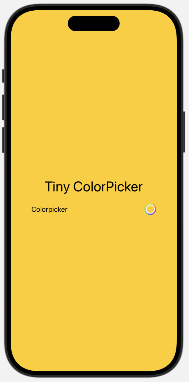
A `ColorPicker` is a standard component to select a color. Use it by adding `ColorPicker` and give it a binding to a `Color` state.
import SwiftUI

struct TinyColorPickerView: View {
    @State var background: Color = .yellow
    var body: some View {
        VStack {
            ZStack {
                background.ignoresSafeArea()
                VStack {
                    Text("Tiny ColorPicker")
                        .font(.largeTitle)
                    ColorPicker(selection: $background, label: {
                        Text("Colorpicker")
                    })
                }.padding(50)
            }
        }
    }
}

#Preview {
    TinyColorPickerView()
}


Use the standard initializer to embed a color picker into the view hierarchy. To disable transparent colors, Use the initializer parameter `supportsOpacity`.
struct SampleColorPickerView: View {
    @State private var color: Color = .red
    var body: some View {
        VStack(spacing: 16) {
            ColorPicker("Color Picker", selection: $color,
                        supportsOpacity: false)
                .padding(8)
                .border(.green)
                .font(.largeTitle)
            Spacer()
        }
    }
}