Swift Charts
Basic SwiftUI Charts
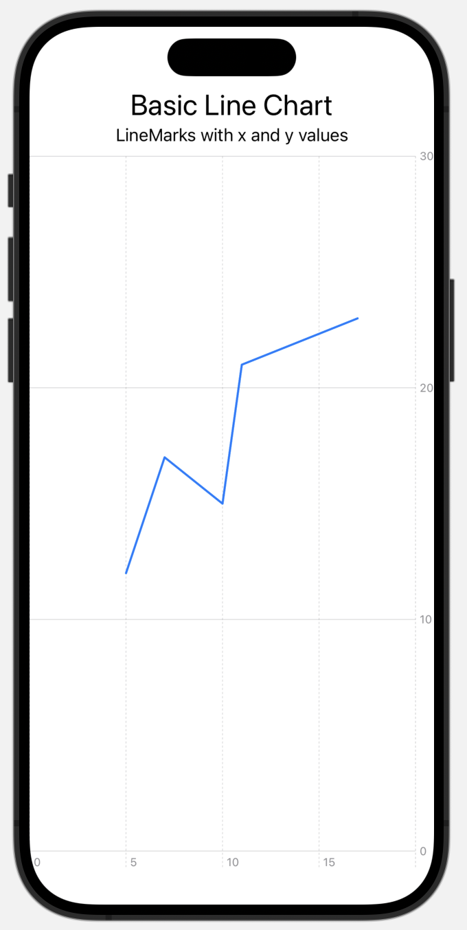
Creating a chart is very simple. There is a Chart view and that view has some marks like LineMark views.
struct BasicChart01View: View {
    var body: some View {
        VStack {
            Text("Basic Line Chart")
                .font(.title)
            Text("LineMarks with x and y values")
            Chart {
                LineMark(x: .value("Key", 5.0), y: .value("Value", 12.0))
                LineMark(x: .value("Key", 7.0), y: .value("Value", 17.0))
                LineMark(x: .value("Key", 10.0), y: .value("Value", 15.0))
                LineMark(x: .value("Key", 11.0), y: .value("Value", 21.0))
                LineMark(x: .value("Key", 17.0), y: .value("Value", 23.0))
            }
        }
    }
}
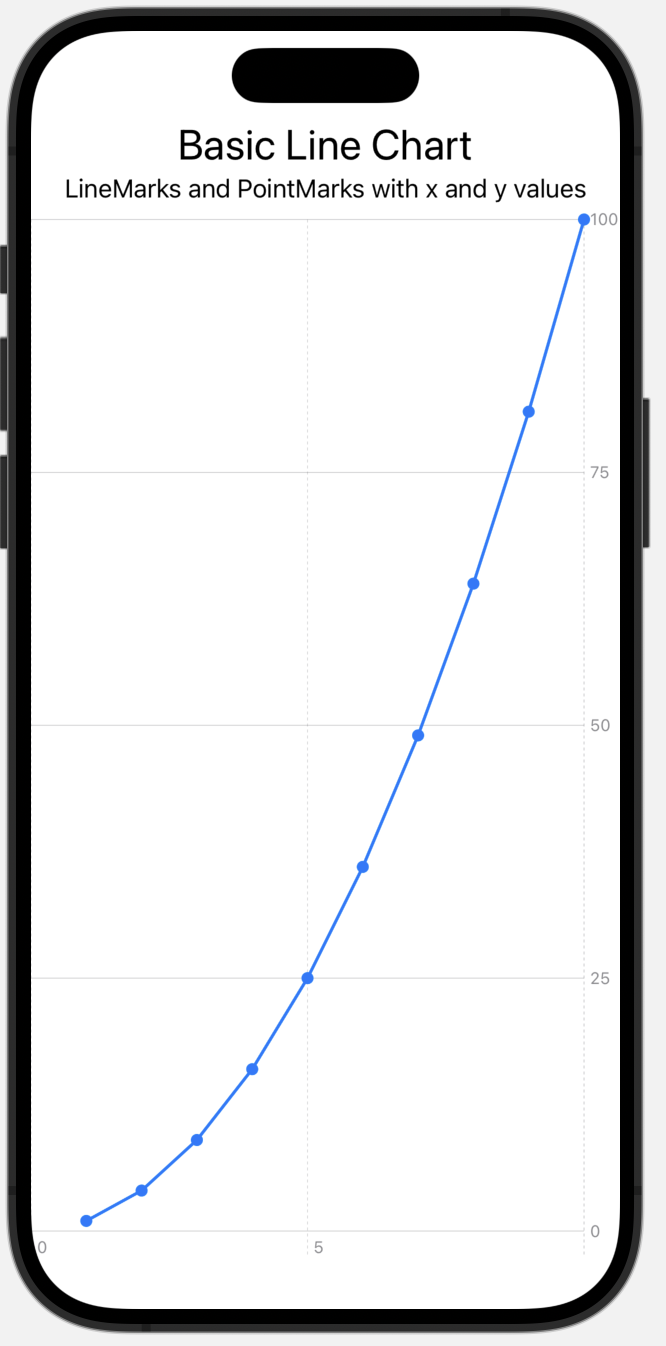
With a combination of point and line marks the data points can be made more prominent.
struct BasicChart02View: View {
    @State var data: [(Double, Double)] = (1 ... 10).map({ (Double($0), Double($0) * Double($0)) })
    var body: some View {
        VStack {
            Text("Basic Line Chart")
                .font(.title)
            Text("LineMarks and PointMarks with x and y values")
            Chart {
                ForEach(data, id: \.0) { item in
                    PointMark(x: .value("key", item.0), y: .value("value", item.1))
                        .symbol(.circle)
                    LineMark(x: .value("Key", item.0), y: .value("Value", item.1))
                }
            }
        }
    }
}
The general chart appearance can be styled quite nicely:
The first chart of that screenshot represents the standard formatting.
For the second chart the background has been changed, the foreground color of the data marks adjust and the Y-axis labels are modified.
Chart {
    ForEach(data, id: \.0) { item in
        PointMark(x: .value("key", item.0), y: .value("value", item.1))
            .symbol(.circle)
        LineMark(x: .value("Key", item.0), y: .value("Value", item.1))
    }
}
.foregroundStyle(Color.red)
.background(content: {
    Color.yellow.opacity(0.2)
})
.chartYAxis {
    AxisMarks {
        AxisValueLabel()
            .font(.body)
            .foregroundStyle(Color.purple)
    }
}
The third chart shows some custom axis marks:
Chart {
    ForEach(data, id: \.0) { item in
        PointMark(x: .value("key", item.0), y: .value("value", item.1))
            .symbol(.circle)
        LineMark(x: .value("Key", item.0), y: .value("Value", item.1))
    }
}
.chartYAxis {
    AxisMarks(values: .automatic(desiredCount: 10))
}
.chartXAxis {
    AxisMarks(values: [0, 2, 10]) {
        AxisValueLabel(format: Decimal.FormatStyle.number.precision(.significantDigits(3)))
    }
    AxisMarks(values: [0, 1, 2, 3, 4, 5, 10]) {
        AxisGridLine(stroke: StrokeStyle(lineWidth: 2)).foregroundStyle(Color.green)
    }
}